Accelerate Blog / Call-to-Actions Your Audience Won’t Resist to Click
Call-to-Actions Your Audience Won’t Resist to Click
- Written by Keziah Cruz
- published on May 13, 2021
Think about the first time you found a product or service? How was the experience? What drew you to sign up? Was it the copy? Was it the design? Was it the call-to-action? Think about it. For sure, there’s a reason why. If you hadn’t been drawn in by compelling content and actionable CTA, you would probably purchase online less and use fewer apps than you do now.
Unbounce reported that 90% of website visitors read headlines and call-to-action copy more than the body paragraph. Whether your inbound marketing goal is to drive downloads, increase sales, or build up an email list of subscribers, it’s imperative to guide your visitors through the buying journey using compelling CTAs. If your CTA is too vague for the type of content you’re promoting, your visitors will leave and not convert.
No matter what your goals are for your email campaigns, you will need a compelling call-to-action to guide your audience towards the action you want seamlessly.
In this article, we’ll break down call-to-action examples your audience won’t resist clicking.
What is a call-to-action?
In marketing, a call-to-action is an action copy that tells your audience what they should do after viewing your website. A CTA is something you’re asking the visitor to do after they perform a specific action.
The best call-to-actions will win over a user and lead to a new customer or prospect in your marketing funnel. This makes a call-to-action a very powerful tool in a digital marketer’s toolbox.
Every call-to-action serves a purpose and knowing what works and what doesn’t will change how you design your ads and landing pages.
How do you create a call-to-action?
Just like every marketing campaign, you need to determine the goal you’re trying to achieve for your CTA. Is it to increase subscription? Boost sales? Drive readers to download an asset?
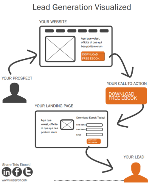
Image from HubSpot
The best call-to-actions will win over a user and lead to a new customer or prospect in your marketing funnel. This makes a call-to-action a very powerful tool in a digital marketer’s toolbox.
Call-to-Actions that Convert Visitors
Here are CTA best practices to apply.
1. Action-Oriented Text
Your call-to-action buttons must feature staggering and action-oriented text. Instead of using words like “submit” and “enter”, use words like “get,” “reserve,” and “try.” These action words go along well with relating CTAs to your offer.
Let’s use Progressive as an example. When you use a custom landing page, Progressive’s technique is a great example to drive leads with a concise “Get a quote” button.
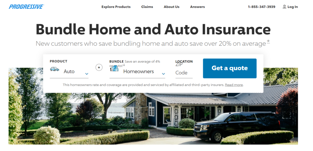
Image from Progressive
Let’s use Progressive as an example. When you use a custom landing page, Progressive’s technique is a great example to drive leads with a concise “Get a quote” button.
2. Button Colors
Your button color matters. According to Kiss Metrics, different colors inspire different emotions. Green and orange buttons are reported to perform best. But of course, it will depend on your website design and layout. If green and orange don’t fit in your design and overall aura, contrasting colors work best to make striking buttons that stand out.
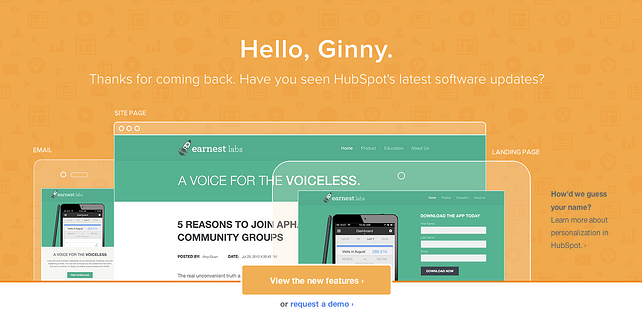
Image from HubSpot
Let’s use HubSpot as an example. Not only did they achieve contrasting colors, they even used the top-performing colors. If you’re unsure, which would look best, try running a squint test and see what comes off as most appealing.
3. Bonus Button Trigger
You’ll run into a situation wherein you may want to consider adding an extra line of information within your button text.
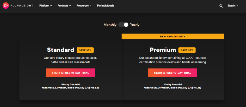
Image from Pluralsight
For example, Pluralsight has a free trial button and a trigger that explains what the free trial includes. Bonus button text is valuable info that will encourage users to click through. Here are some examples:
- Additional information (e.g. No credit card required)
- Key Benefits (e.g Receive free consultation)
- Data Points (e.g. Users see a 20% increase in shares when using X)
Remember, adding bottom triggers won’t always be necessary, but this extra information can help increase click-through rates when it fits.
4. Choice Paradox
We tend to suffer from the choice paradox. According to Mark Lepper of Columbia University, we tend to become happier when we have limited options to choose from.
Let’s take Hotjar as an example. They gave two options for a “Sign Up” call-to-action on their homepage. But they also gave their prospective customers a seamless experience. They integrated it directly with Gmail to allow users to sign up with one click.
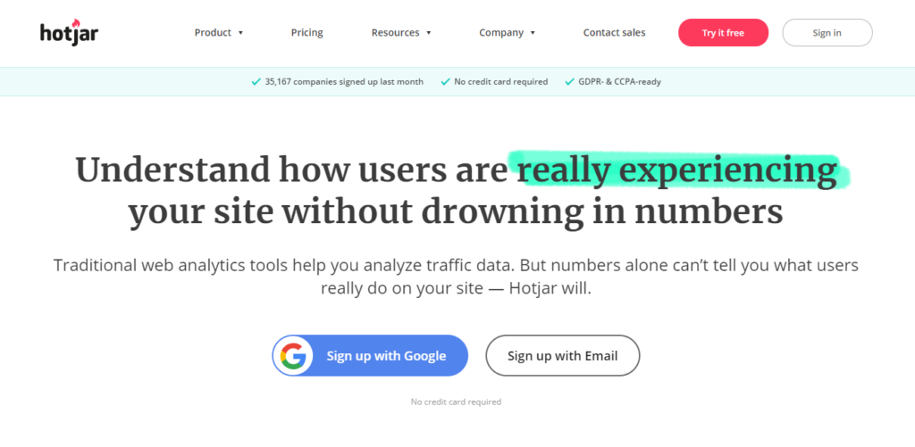
Image from Hotjar
5. User Flow
Keep your CTAs placed in a natural reading flow. Call-to-action buttons placed at the bottom or to the right outperform alternative placements.
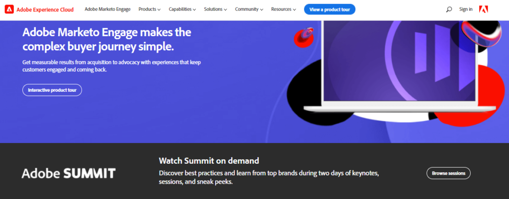
Image from Marketo
Let’s look at Marketo’s CTAs. The company placed all its CTAs in appropriate places that align with a user’s experience. For example, you would want to put a “View product tour” button in a spot where a user would find it even when navigating through the website.
Sometimes having two CTAs is great. But you need to differentiate each button.
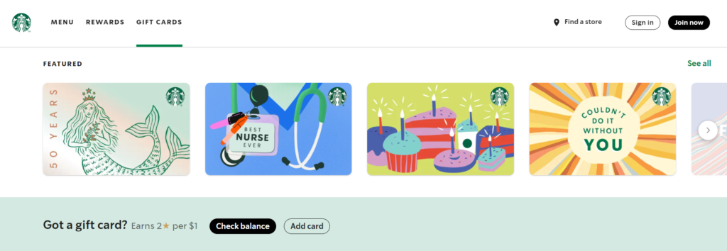
Image from Starbucks
Let’s use Starbucks as an example. Their secondary CTA is less attention-grabbing than their main CTA button. Your main call-to-action button should always stand out.
Final Thoughts
These are just some of the practical call-to-action best practices you can apply in your marketing campaigns. Remember, the road to higher conversions will still depend on you. It’s best if you conduct a lot of testing.
Every marketing campaign you run must have a CTA. It’s best to determine your goal, use action verbs and be strategic with the placement, design, and colors of your CTA buttons.
Subscribe to our newsletter.
By clicking subscribe, you acknowledge Accelerate uses your information in accordance with its Privacy Policy. You may unsubscribe at any time using the link in our emails.